Not all type is created equal!

Any font will look great on the web, right? WRONG! Not every font you use in print translates well onto the web. Typography on the web can be unpredictable and tricky. It’s sometimes considered more difficult to work with fonts for websites because the rendering cannot be tweaked exactly to perfection 100% of the time (which can be a big annoyance to my fellow perfectionists who like things to be just so.)

Web typography takes a little more effort and time to get things exactly as we imagine they should be, and even then our desired outcome is not always guaranteed. There are many factors and variables that go into web typography that make it differ from print typography. Things such as stroke thickness, line length, and even what browser the reader is using have to be taken into account for typography on the web. When all of these variables are realized and mastered, then a great website can be made!

The first thing to realize when working on the web is that browsers, monitors, and computer operating systems can render fonts differently, even when the coding is all the same. You can see in this example below how the same text can change slightly depending on what browser the viewer is using.

https://i0.wp.com/assets-www-dtelepathy-com.s3.amazonaws.com/wp-content/uploads/2014/06/Cross-Browser-Fonts-Rendering.png

This is what is so unpredictable about web typography, but it is something we just have to accept and live with. Because of this, it’s best to test your websites on as many different browsers and monitors as possible to make sure that nothing weird is happening anywhere with your typography.

Web safe fonts are structured differently than fonts to be used in print. To avoid eye strain, it is important for web fonts to have thicker strokes, large x-height, and bigger bowls and counters. The letter shapes should be distinct, making the difference between characters obvious and easy to read. The line length should be limited and text should typically be flushed left to keep things readable and to avoid the unthinkables, like rivers. You can learn more about the structure of web fonts and how they differ from other type in this article. Basically, everything that goes into making web fonts distinct and different from fonts used for print focus on readability and ease of use for the viewer.   

So now you’ve learned a little bit about web typography and what makes it different than print. The goal of web typography is functionality and legibility to make it easy for the user. Luckily, there are certain typefaces that were created specifically for us to use on the web and are considered “web safe fonts.” They are structured especially for the web for ease of use and high readability. 

To learn more information on enhancing your web typography skills, visit this helpful tutorial.
Local Business Battle: Weak vs. Strong Websites

So we’ve talked about typography on the web, but what else goes into making a website strong? The navigation, the content, and the layout are all major components that go into the overall aesthetic of a website and help differentiate between strong and weak pages.  

Let’s start by evaluating a poor website. Bear Rock Junction is a local business from where I live, and overall their website could use some help. http://bearrockjunction.com/

The navigation is located at the top of the page and, aside from being a little lack-luster in design, the titles of it are pretty straightforward and descriptive. However, there are two sets of navigation that become a little confusing. There are white links on the blue background which almost overshadow the main black-on-white tabs above. Also, the home button could be discarded if the logo was made into a link for home navigation instead.

The layout and the content of the page could use some improvements as well. The hierarchy of the pages need a little more work and clarity to distinguish between important information. There is contact information located at the top of each page that could probably be moved to a better spot, such as to the footer or a contact page because it is distracting from the navigation, banner, and logo.

The content gets the point across, but pictures are scattered and information is all over the place. The pages would benefit from better organization and location of information.  Also, I’m not quite sure what’s going on with the home page, but when you scroll over the content, it becomes active like a link. Some content should be combined in a better way to reduce the amount of pages and overall confusion of the layout.  

The whole aesthetic of the website feels very basic and beginner without much nod towards design, other than some vibrant (nearly blinding) colors thrown in there. Some smarter font choices should be made and the whole site needs to be designed in a more pleasing way to keep it from being overwhelming.

On the opposite side of the spectrum, we will look at another local Lehigh Valley business, Paisley Peacock, as an example of a strong website. http://paisleypeacockfloral.com/

When you first arrive at the homepage, it immediately has a more professional feel to it and you know what it’s all about. There is not a lot of content on the home page as the images tell the story. We are greeted with a scrolling banner and pictures that are used as links, thus showcasing the flowers and the work that they do.

Simple navigation is located at the top of the page with drop-down menus that specify further categories. The menus are hidden when you are not scrolled over them so that they don’t take away from the rest of the content on the page. The logo acts as a link to the homepage, and additional navigation is located on sidebars of the other pages. Also, there is a small link at the bottom of each page that directs you right back up to the top, preventing endless scrolling.

With a clear sense of hierarchy and the content in an appropriate font, the whole site has a consistent feel. It’s clean and simple with the colors of the flowers standing out, keeping it from being overwhelming like the other website.

Many more factors go into making a good website, but without a strong layout, content, and navigation, the pages are hard to get through.

Will it pass the typography test?

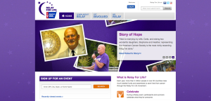
How do you evaluate a website for good typography? Is it simply the colors? The font? The size? There’s a lot more that goes into type design for the web. Let’s look at a few components that make up a typographically dynamic webpage using relayforlife.org.

Let’s start with the font-family. This page consistently uses a sans-serif typeface at various sizes and in different colors to differentiate between content while still creating a cohesive look. This use of size and color are what establish the hierarchy of the page, with the headings either purple or blue and in a larger point size than the gray text of the paragraph content.

The text is left justified, which is common and easiest to read, and the line spacing varies based on the font size to make sure everything is legible and doesn’t run together. The page uses appropriate font sizes throughout with nothing too large or too small. Everything, including the footer, is legible.

An appropriate amount of whitespace is used between information so that the content does not run together and sections are separated. There are also purple borders on the left and right of the page, centering the information on the screen and balancing the page so you aren’t overwhelmed with content displaying across the entire browser window.

The contrast is where this webpage can lose a few points, depending on who is reading it. There is enough contrast for me to be able to read it. However, I don’t know how easy the gray on white or the gray on gray content would be to read if someone is more visually impaired. It might be okay, it might not…I can’t be positive.

All of these elements-font-family, font-size, color, hierarchy, line-spacing, alignment, contrast, whitespace, etc.-make up the websites overall readability, or how easily the content can be read and understood. Overall, the Relay webpage is easy to read and grasp. The first thing on the home page that catches your eye is the scrolling banner of images with the slightly transparent text box anchored to it. All of the text on the page is legible and separated into its own logical section.

So what grade does this page earn on the typography test? I’d say it deserves a solid A…easily read and understood.

Relay For Life Home Page

Future Web Designer in the making?

Even though I’m still just beginning to learn about web design, at this point I’m thinking it might be the career path that I want to take. I love the production aspect of handwriting HTML and CSS to make a web page from scratch look exactly how I want it, right down to the last horizontal rule. I want to be able to make simple personal pages for me and for friends and family and then eventually work with a design group in a firm. There’s a design company close to where I live that revamped the website for the company my dad works for and I would love to talk to them about everything I should expect from that type of job.

As a visual learner and overall design driven person, I think that web design could definitely be the direction I go in. I’m very organized and detail oriented, which is beneficial in this field. There are some aspects that I still need to work on, like learning JavaScript and handling multiple tasks and responsibilities for a project, but I still have tons of learning to do. With the rapid development of technology, the learning will probably never end!

As far as equipment goes, I have enough to get by for now. I have TextWrangler and Adobe Illustrator and Photoshop on my personal Macbook along with some extra external memory…probably enough to be considered a “beginner.” Ideally in the future I would love to have The Adobe CS-whatever Master Collection on my own huge Mac computer with a scanner and extra computer available for testing, buuut I think that’s a bit over my price range right now.

Hopefully this class can help me make up my mind as to what I want to do with my life. I should probably figure that out sometime soon…growing up is hard.